Back to projectsWeb design / Responsive website

Selected work · 2021–2025

RingCentral.

Four years. Hundreds of pages.

I designed pages across several ringcentral.com redesigns, alongside the design and illustration systems that supported them.

Explore the case
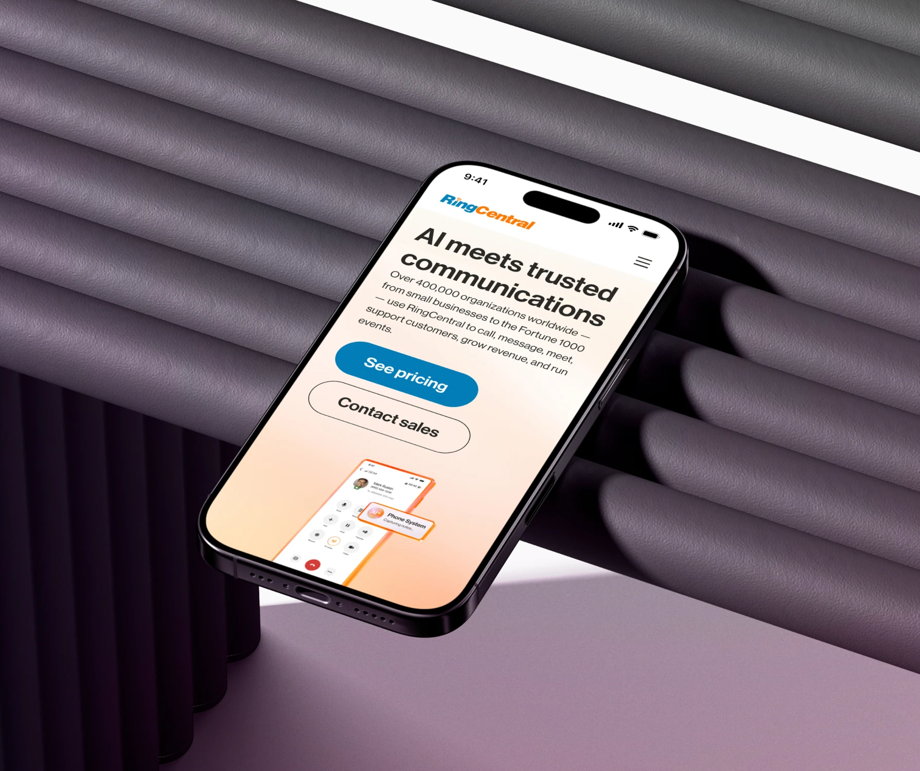
RingCentral’s mobile homepage on a phone against a dark lilac backdrop
My role
Web Designer
Period
Mar 2021 – Mar 2025
Platform
Responsive web
Scope
Website · Design systems · Illustration

Overview

One website.
Many ways in.

A visitor comparing plans needs something different from someone exploring a product for the first time.

I designed landing pages and other pages across the site, mapping user flows and prototyping key interactions. The work below shows how I adapted the layouts to different decisions while keeping the site visually consistent.

The website

Give each page a clear job.

I worked on pages for different points in the customer journey: comparing plans, exploring integrations, and understanding what a product can do. For Enterprise Contact Center, I designed the complete page; the card opens the full layout.

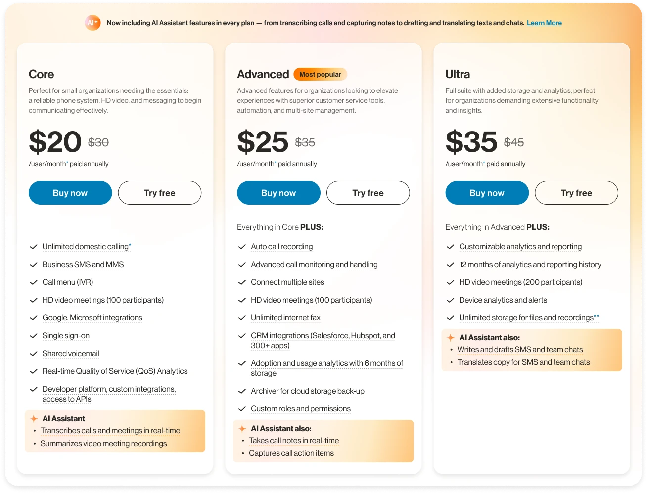
Three RingEX plans with aligned pricing, features, and actions
RingEX plans and pricing · Current page
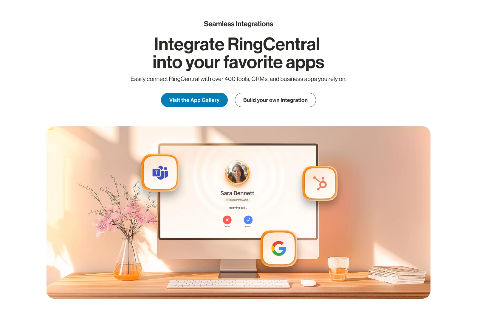
Integrations overview design introducing RingCentral’s app ecosystem
Integrations overview · Current page
Enterprise Contact Center · Full page design · Open to explore the complete page
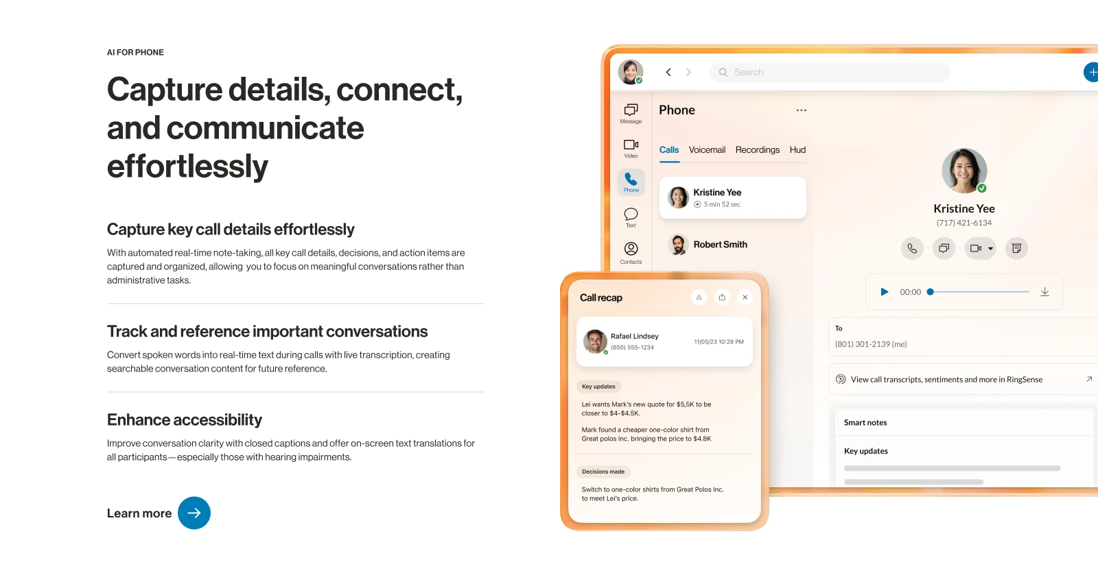
Personal AI Assistant feature section pairing an explanation of call notes with interface examples
Personal AI Assistant · Feature section · Current page

One landing page, two layouts.

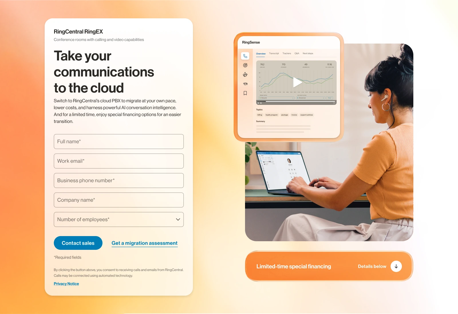
For the cloud migration page, the desktop hero pairs the form with the product visual. On mobile, the visual introduces the offer before the form.

Desktop cloud migration hero with the contact form beside the product visual
Cloud migration landing page · Desktop
Mobile · Open for details

A homepage built together.

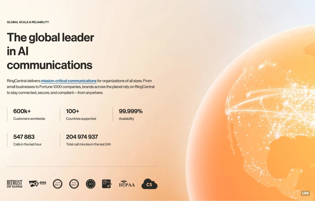
The homepage redesign and its graphics were a team effort. The homepage preview opens the complete page design, followed by the global scale module in context.

Homepage · Team redesign · Open to explore the complete page
RingCentral global scale homepage module with text and a rotating orange globe
Global scale module · Team-designed graphics · Motion by other contributors. Live module

Atomic web design system

A system for building.
And building again.

When I joined, there was no shared web design system.

Working with the team, I helped build it from scratch, creating reusable components and introducing Auto Layout. This made day-to-day design work easier.

The library follows an atomic structure: foundations and controls combine into molecules, which form larger organisms and page layouts. My work extended across those levels, including responsive variants and reusable modules for different page types.

  1. Atoms

    Colour, type, spacing, icons, and controls.

  2. Molecules

    Cards and small groups of related elements.

  3. Organisms

    Complete sections: heroes, products, benefits, and more.

  4. Pages

    Sections assembled for a specific user journey.

Start with the foundations.

Colour, typography, corner radii, and interaction states give the library a shared foundation. These rules carry through to every form, card, and section.

Colour primitives
Typography scale
Button sizes, styles, and states
Input fields · Default, filled, focus, and error states
Selection controls · Checkboxes and radio buttons
Corner radii · Sizes and application

Molecules with a defined job.

Feature cards, headline groups, and accordions combine atoms into patterns with a clear purpose. Their variants handle different content, interaction states, and screen sizes.

Molecules · Feature card variants
Headline groups · Desktop, tablet, and mobile
Accordion · Open and closed states across breakpoints

Organisms that do the heavy lifting.

The library includes families of complete sections, with layout options and breakpoint variants. These are the reusable building blocks for a page, rather than isolated UI controls.

Hero

A responsive family of opening sections, with left-aligned, centred, and B-roll layouts.

Desktop · Left-aligned hero
Tablet · Left-aligned hero
Mobile · Left-aligned hero
Centred hero · Medium layout
B-roll hero · Media with feature list

Products

Reusable product tiles with desktop, tablet, and mobile layouts.

Products · Desktop tiles

Benefits

Benefit groups with alternative icon treatments and breakpoint variants.

Benefits · Glass icon variant

Z Cards

Text and image sections with simple, lines, accordion, checkmark, and sticky navigation layouts.

Z Card · Accordion layout

Industry

Tabs, carousels, and sliders for presenting industry-specific solutions.

Industry · Tabs layout

Features

A larger composition with a content column and a grid of feature cards. Large and small card variants adapt across breakpoints.

Features · Small card variant

Responsive rules are part of the system.

The layouts document how components sit on the grid at different breakpoints. The same component families have desktop, tablet, and mobile variants.

Layout foundation · Tablet landscape grid

Illustration library

One visual language.
Many industries.

I created illustrations and worked on the library of reusable elements and complete scenes. The industry collections show how the same visual language could tell different stories. These examples come from an earlier RingCentral visual style.

A collection for every industry.

Healthcare, finance, retail, education, and other sectors each had their own scenes. Desktop compositions and mobile adaptations keep the same visual language at different sizes.


Healthcare industry illustration from the RingCentral library
Healthcare
Financial services industry illustration from the RingCentral library
Financial services
Retail industry illustration from the RingCentral library
Retail
Professional services industry illustration from the RingCentral library
Professional services
Real estate industry illustration from the RingCentral library
Real estate
Education industry illustration from the RingCentral library
Education
High tech industry illustration from the RingCentral library
High tech
Government industry illustration from the RingCentral library
Government
Nonprofit industry illustration from the RingCentral library
Nonprofit
Startups industry illustration from the RingCentral library
Startups
Healthcare illustration adapted for mobileFinancial services illustration adapted for mobileRetail illustration adapted for mobileProfessional services illustration adapted for mobile
Mobile adaptations · Healthcare, finance, retail, and services
Real estate illustration adapted for mobileHigh tech illustration adapted for mobileGovernment illustration adapted for mobileNonprofit illustration adapted for mobile
Mobile adaptations · Real estate, tech, government, and nonprofit

From a room to a conversation.

I also drew room and video-call illustrations, with variants for different spaces and group sizes.
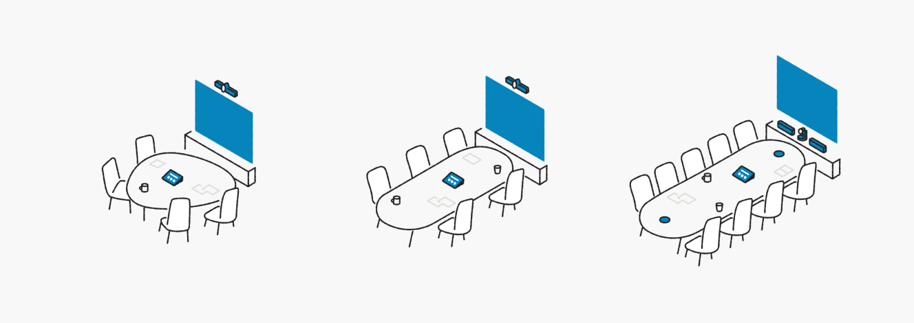

Room illustrations · Small, medium, and large spaces
Video calls · People, conversations, and groups

The details that hold it together.

Hands, icons, plants, and pictograms form a set of reusable ingredients. Each collection follows a common grid here, so the individual shapes have space to breathe.
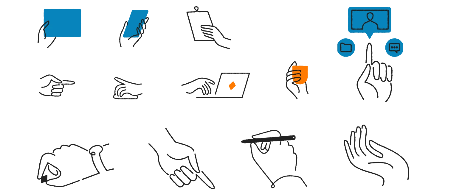
Reusable illustrated hands and gestures
Hands and gestures

Small pieces, used throughout.

Icon families and pictograms translate the same language into smaller formats, with recognisable shapes and restrained colour.


Icons · Orange and blue variants
GSP pictograms · Services, people, and progress

Character in the details.

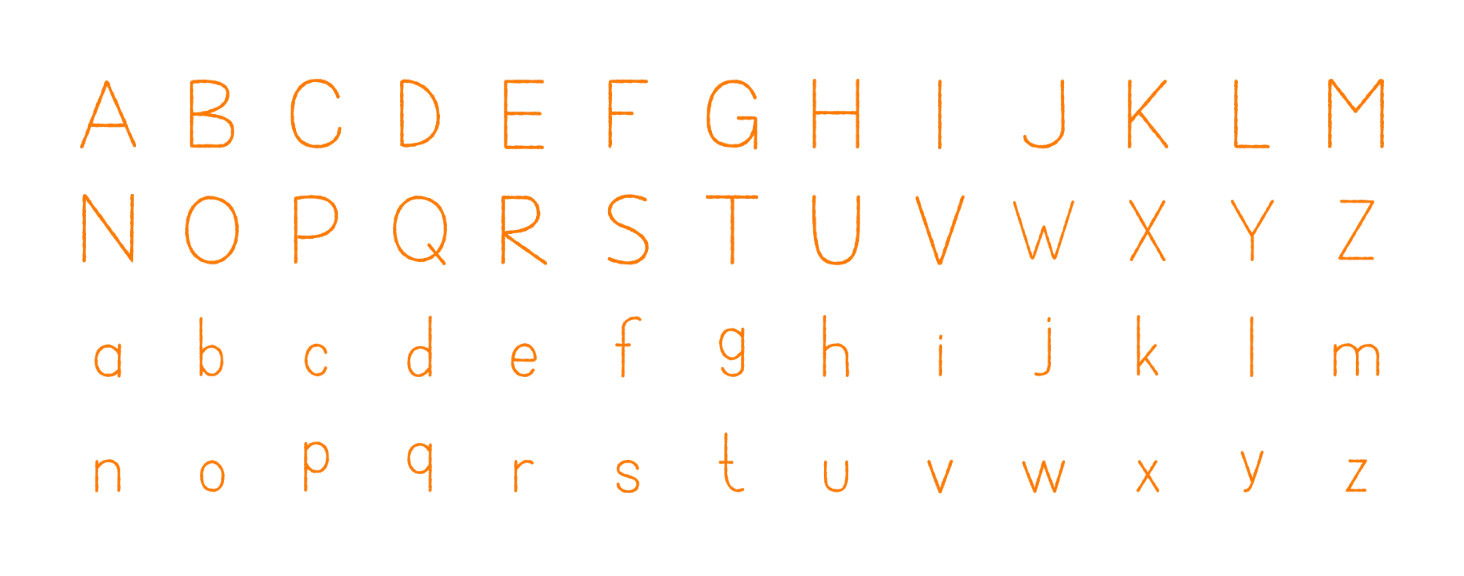
Plants add expression to larger compositions. Illustrated numbers and letters extend the collection into typographic treatments.

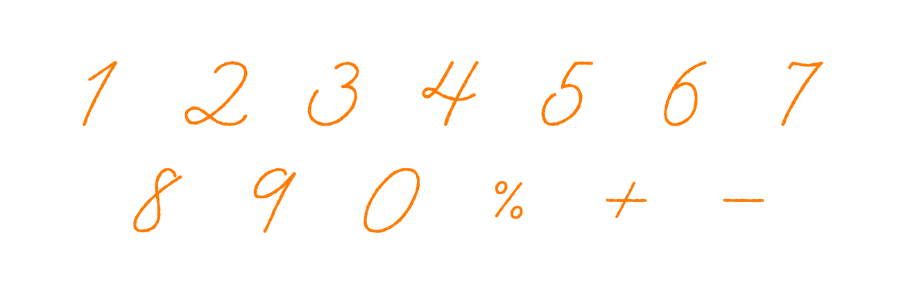
Plants · Indoor collection
Illustrated numbers and symbols
Illustrated alphabet · Uppercase and lowercase

A library people can use.

The usage guide explains how to find illustrations, adjust component variants, and contribute new work. It connects the collection’s atomic structure with the team’s everyday workflow.

View the full guide
Guide · Library ecosystem
Guide · Adjusting component variants
Guide · Adding and organising components

Contact

Have something
in mind? Say hi

A project, a role, or just a hello.
I’d love to hear from you.

Press Escape to close